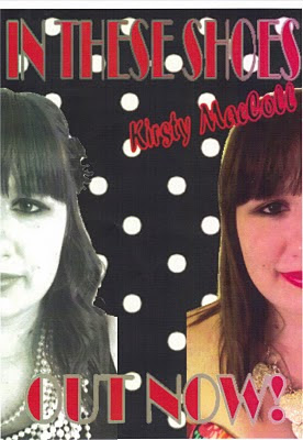
- The image above parallels our original idea, although during production we made some minor changes. For example, the main image is of the 'artists' face - actually Jess Turner, a member of our group - with her face split into two. However, rather than divided down the centre, we decided the splitting her face either side of the poster on the left and right would be more ideal as the font and writing could be more clearly read down the centre. During production, we found difficulty reading the writing whilst the face was in the centre. Therefore, we over came this here, as well as making the image still look appealing.
- In relation to the face, we have still stuck to the original separate-era idea. As you can see, on the left hand side of the poster, the 'Great-Gatsby'-inspired era is represented. This is through the use of black and white, the females curly hair and hair piece, and the slight visibility of stereotypical clothes - a black dress with lots of beads. On the right hand side, a contrastment follows with a present-inspired era, as the girl is in brightly-coloured, edited contrast; she has straight hair with bright lipstick, and the parts of her clothing visible are bright, too. Therefore, this is clearly represented, and will show synergism alongside our video, with our ideas falling alongside these two separate eras. We will be precise with our productions, with the Jess (above) wearing the exact outfits and similar accessories as above.
- The iconography of the poster is quite similar to our pilot idea. We have stuck to the artist's name being in fancy italic font to give a formal, old-fashioned essence, where as the contrast with the bold lettering in both the singles name and 'OUT NOW!' hinting at previous years. Both 'IN THESE SHOES' and 'OUT NOW!' follow the same font, following iconography, so they are recognisable to each other. On top of this, they follow a mirrored line, being both at the top and bottom, likewise to the photo being at both the left and right.
- The background also adds to our original ideas, with the pretty, girly polka-dot look. We have followed black and white colours, as well as using average-sized dots to not draw too much attention away from the main image. However, they compliment the overall poster well, as well as following both eras.
- We feel as a group that this poster follows alongside typical music advertisements, including the artist, their name/song title, as well as a recently used 'OUT NOW!' slogan. Therefore, it draws attention with its brighter colours and typical slogan, whereas it is unique and unusual, following alongside the video, achieving our main aim of synergy.
Tuesday, 29 June 2010
Final Music Poster
Here is our final idea for our music poster. On Friday we designed this together as a group on Corel Photo, a programme on our school computers. This was an easy way to pull our ideas together, as we could upload large images with cutting/selecting them easily, and use a wider range of edits. The font is easy to place, too, as well as stretch and distort backgrounds to our liking.
Subscribe to:
Post Comments (Atom)

No comments:
Post a Comment