Tuesday, 29 June 2010

Preparation towards our video

We took some photographs on Monday as Jess' house to contribute towards our music video. Whilst Jess was dressed up for the mini photo shoot for the music poster, I took a long-shot photo of her in her 'flapper' outfit, in order to provide a visual image of what she will look like. Here is the idea:


Next, we took a photo of the dress that she will be wearing in the first half of the video. It is a flowery short dress, which is bright in colour, therefore complimenting the present, summery month. Here is the dress:

Adding to this, the main motif of the video will be of the shiny red heels, which is an original idea we have stimulated from the start. This is due to the obvious similarity to the prop with the title of the song, 'In These Heels'. Therefore, we feel it is essential to provide an image of these shoes, which can be worn both formally and for fun, also complimenting both eras:


Added to this, we felt it would be essential to include a photograph of the setting. Below features the bedroom set that will feature in the present era of the video - in the first half of the song. It is a cream, fairly large bedroom, with girly bright colours and furniture such as the pink bed, stereotyping it as a females bedroom. At the time of the picture being taken the drawer/mirror that will show the girl getting ready cannot be seen, but we are considering placing it on the right hand side of the room - situated in the photo - opposing the bed. Therefore, enough room can be made to show the girls friend walking off camera and possibly viewed in the background, as well as the main artist - Jess - moving around her room in front of the camera, getting ready.


In relation to props, here is a guitar that we will feature - from the opening of our video to being used within the room above:

Here is an image of a lipstick mark that we may plan to use on our digital booklet. It correlates with preparation for our video, as Jess will wear pink lipstick in the present era - as well as red in the black and white later era, so that the red lipstick will stand out. Here is an idea of the print:


Final Music Poster

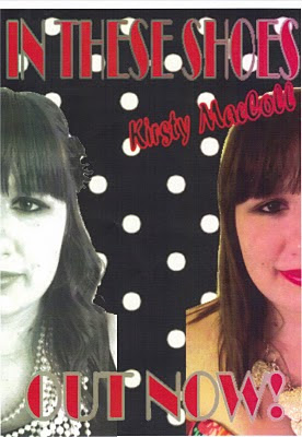
Here is our final idea for our music poster. On Friday we designed this together as a group on Corel Photo, a programme on our school computers. This was an easy way to pull our ideas together, as we could upload large images with cutting/selecting them easily, and use a wider range of edits. The font is easy to place, too, as well as stretch and distort backgrounds to our liking.

  1. The image above parallels our original idea, although during production we made some minor changes. For example, the main image is of the 'artists' face - actually Jess Turner, a member of our group - with her face split into two. However, rather than divided down the centre, we decided the splitting her face either side of the poster on the left and right would be more ideal as the font and writing could be more clearly read down the centre. During production, we found difficulty reading the writing whilst the face was in the centre. Therefore, we over came this here, as well as making the image still look appealing.
  2. In relation to the face, we have still stuck to the original separate-era idea. As you can see, on the left hand side of the poster, the 'Great-Gatsby'-inspired era is represented. This is through the use of black and white, the females curly hair and hair piece, and the slight visibility of stereotypical clothes - a black dress with lots of beads. On the right hand side, a contrastment follows with a present-inspired era, as the girl is in brightly-coloured, edited contrast; she has straight hair with bright lipstick, and the parts of her clothing visible are bright, too. Therefore, this is clearly represented, and will show synergism alongside our video, with our ideas falling alongside these two separate eras. We will be precise with our productions, with the Jess (above) wearing the exact outfits and similar accessories as above.
  3. The iconography of the poster is quite similar to our pilot idea. We have stuck to the artist's name being in fancy italic font to give a formal, old-fashioned essence, where as the contrast with the bold lettering in both the singles name and 'OUT NOW!' hinting at previous years. Both 'IN THESE SHOES' and 'OUT NOW!' follow the same font, following iconography, so they are recognisable to each other. On top of this, they follow a mirrored line, being both at the top and bottom, likewise to the photo being at both the left and right.
  4. The background also adds to our original ideas, with the pretty, girly polka-dot look. We have followed black and white colours, as well as using average-sized dots to not draw too much attention away from the main image. However, they compliment the overall poster well, as well as following both eras.
  5. We feel as a group that this poster follows alongside typical music advertisements, including the artist, their name/song title, as well as a recently used 'OUT NOW!' slogan. Therefore, it draws attention with its brighter colours and typical slogan, whereas it is unique and unusual, following alongside the video, achieving our main aim of synergy.

Monday, 28 June 2010

Further planning of poster

In order to complete our music poster, me and Jess took photographs at her house after college on Monday night to contribute to the artists split face on the image.
We completed two different looks - a present and a past. Within the present, Jess had straight hair, average make-up of eyeliner/mascara, bright pink lipstick, a flowery dress, a gold-heart necklace and wore the trademark red heels that will be featured in the video (although this isn't visible in the photo shoot.) The look can be found below: In the past-era, she has curled her hair (with a black flower clip in it), has red lipstick, flicked eye-liner (a typical flapper look), is wearing a black loose dress, lots of beads as a necklace and also the red heels. Here is the look:

Jess stood in the same position against a blank wall, as well as pulling the same face with a slight smile, to achieve similar looks, so that during production it was easier to part both images.
These two looks contribute to our pilot ideas, and will be used on our music poster. We may also find them useful towards our digipack later on this week when we begin an initial idea for that, as well as actually making the CD holder.
Both looks also add to synergy to our video ideas, as well as just said, compliment to our digipack ideas, therefore achieving our music production aims.

Planning for music poster

Part of our task is to produce a music poster, synergising with both our video we are to produce and the digital booklet for the CD. On Wednesday, we made a list of various ideas upon what could be put on both our poster and booklet, and we conducted these ideas:

  • Pink guitar (as this would be recognised on the video)
  • High heels (being the main motif)
  • Girl in different eras? From colour to black and white, in relation to original ideas
  • Girl divided into two to relate to this - two faces? Divided into two?
  • Lipstick
  • Jewellery
  • Hairbrush
  • Mirror
  • Close up of face
  • The table/mirror being used
  • Bags/keys
  • Coats - leopard coat/blue coat
  • Disco things
  • Black and white contrasting with colour
  • Lips up close
  • Dancing

From these ideas, as a group we conducted up various ideas, concluding with this pilot, rough summary for a poster:

It follows the idea of using the girls face, although her face has been divided into the two different eras as to be shown in the video - of present and the 1920's. The artist's name, Kirsty MacColl, is written across the top left, in fancy, formal italics. This parallels an old-fashioned font, hinting at the elder era. However, the title of 'IN THESE SHOES' is bold and striking, falling alongside the present era. We used typical stereotypes that are found alongside other posters, such as the 'OUT NOW' bold font found underneath.

Her face is clearly divided into two, with the left being brightly coloured with brown straight hair and pink lips. Her eye make-up is applied normally. The right side of her face is in black and white, therefore complimenting the previous era. We have therefore designed this part in black and white, in grey pencil, and outlined her eyes in a typical 'flapper' style. Also, we have decided to curl her hair and will use a hair accessories in the actual piece.

On top of this, although it is quite faint, we have planned to use large polka dots for the background as this is quite fashionable during this present time, whilst it is retro for the past era.

Thursday, 24 June 2010

Initial Ideas for preliminary video

Last week, as a group we have been conducting ideas for the video for 'These Shoes', in order to converge alongside the lyrics and typical stereotype of a female artist and the title. Although we are not certain we will use all of these original ideas, they are a summary upon what we will follow. Upon the day, we may make variations if our initial ideas to not appear visibly accurate. However, these ideas are what we will most likely follow:
  • In colour, an up close of a pink guitar (to highlight femininity) being strummed in time to the guitar sound. She has red nail varnish to add to this, with this being a motif throughout the rest of the video
  • A dissolve edit will follow, as the 'pull' effect draws the viewer into the song
  • A cut follows, to the camera tracks a girl from behind wearing a towel on her body/head, to give the illusion of coming out of the shower. She walks to the beat of the music, towards a door and into a girls bedroom. The girl disappears into the room, and goes off the camera's lens, whilst the camera turns to the right and down towards a desk/mirror, revealing a girl at a table. We can clearly see the pink guitar from before, leaning against the table
  • Three quick cuts follow, firstly of some red heels on the floor, cutting up to a pink lipstick on the desk, to further along to a brush, which is picked up by the lead girl. The camera pans upwards - still not revealed in the mirror - and shows her beginning to brush her hair. She then starts to sync to the song, opening up the lyrics
  • A cut to a close up of her face - stopped syncing
  • A jump cut to her lips - applying the pink lipstick
  • Shot reverse shot of girl from table again, although now she's pulling away
  • A long shot of girl putting on coat - possible use of jump cuts to add a jumpy effect in mood to the music
  • Cut away close up of her grabbing keys off the side
  • Cut away of grabbing bag
  • Close up from crab shot of girl slipping into shoes - possible ways: one already one and tie up next, fast forward of putting both on, slipping into both, etc...
  • The camera is still on the floor, and movement of girl as we just see her shoes move past the camera
  • Long shot from behind girl, revealing her walking towards door and opening it. Use of flash/flashlights on other side of door to give an illusion of bright,neon lights - as though walking into a new light or possible use of dissolve/fade into next shot
  • This method is used to cut to a different era, with this being represented through the colour now being black and white. We see a long shot of Jess walking into a door, paralleling the previous shot
  • Close up of feet walking into bar from front show
  • Girl will now be dressed like a flapper, to represent a 90's era - in a fur coat?
  • A over the shoulder, medium shot from behind shows an individual taking coat off shoulders
  • Pan of girl from the side, showing her walking across bar to then sitting down. Sits down next to a friend. The rule of third will show her in the centre - highlighted
  • Medium shot of girls talking as lyrics continue
  • Close up of lips syncing
  • Girl dressed in revealing dress with legs out - camera pans up but in a jump cut manner e.g. starts on heels then legs then dress then face as as she syncs
  • Different angles of people dancing, finishing in slow motion as she is revealed having fun, to the lasting slow beat of the music

We may insert cut away shots, too, such as the girl standing in a room or by a wall standing alone/lip syncing to the camera, as this will pull the audience away from the dull, repetitive scenes.

We will also need to remember particular props, such as the pink guitar, mirror/desk, red and pink lipstick, particular costumes (for both eras), the red heels, a bag and keys, some towels and various props for the bar scene.

Wednesday, 23 June 2010

Kate Nash synergy analysis

This part of my analysis is based on Kate Nash's 'Made Of Bricks' album, focusing on her first single release of 'Foundations'. I am going to converge the video for this single, the poster/front cover of the actual singles release, as well as its album's front cover.
Firstly, here is a review of the official video for 'Foundations', alongside noted similarities of synergy:


Kate Nash - Foundations
Uploaded by Kate-Nash. - Watch more music videos, in HD!
  • Bright colours are shown through the use of objects, such as opening up with blue and pink toothbrushes, to the use of fashionable accessories - high heels lined up. More colour breaks into this, where a large orange is rolled into these. This could represent a colourful lifestyle, which although is open for more colour, has breakage along the way
  • Fast shots follow to shot a boy/girl (who is Kate Nash) at a table opposite each other, playing a game of cards. The feeling of the scene is quite 'old school', with the use of a board game being selected as entertainment over electrical equipment quite old fashioned. Although this is an assumption, this can be backed up by the surroundings: an old radio, an old dial telephone, tapes and cream coloured decorations, with clutter and an old fashioned feel with the furniture.
  • In relation to the individuals style, they also appear quite old fashioned and retro. For example, the male is in trousers and a cardigan, with messy hair, which is stereotypical for an old man. Kate is dressed in a 50s/60s looking dress, which is bright yellow, paralleling alongside bright yellow tights, as well as loosely curled hair. This adds an old vibe to the video alongside the surroundings, although it also may introduce her style, state of mind and lyrics. Her clothing can be viewed below.
  • This then compliments her laid back vocals with careless lyrics, as they have a husky, classic British sound. She keeps constant eye contact with the camera as she syncs, therefore hinting at an attitude alongside her annoyed lyrics. This emphasises her frustrated character
  • Humour value is hinted at, too, when the goldfish are shown as she sings 'our friends'. It could show a likeliness towards animals
  • Random areas are highlighted throughout the video. For example, there is a pile of skateboards in a doorway, which she kicks, hinting at clutter within this home. Toys are a motif, too, with the use of jump cuts making a range of toy dinosaurs face the audience, followed by a birds eye view of Kate in bed, hugging an alien toy. The random mise-en-scene extras add to a unique twist.
  • The floor is repeated on camera throughout the video, from crab views in tight places under the bed to master shots revealing rooms, all with the same wooden floor. This could highlight the same bleakness is following her, as her lyrics hint at her being bored. The wooden floor comes in handy for the director to use their own personal experiments, however, with jump cuts of socks at fits entwined around one another to breaking apart being clearly shown. The use of the toothbrushes together at the start also jump cut to splitting apart, too, adding to deeper meanings into the 'foundations' of a relationship cracking, therefore complimenting the song.
  • Added eccentric random extras are used throughout, such as lyrics matching the action - 'you wind me up' with a toy being wound up - alongside Kate randomly eating a selection of sour lemons. Bright food is used throughout, too, with a bright orange to a pink cake. These extras compliment Kate's artist nature, as well as how she may pass her time.
  • At one cut Kate walks to the fridge, opening it and singing about beer, which is complimented by beer literally brimming out of the fridge. This adds to her annoyance towards males, however she adds a feminine twist in the next cut by using them as a vase. This underlines her artistic character, as well as bizarre imagination, which is shown throughout the rest of the video. She twists things and makes them her own
  • Kate is shown in a series of dresses, all matching the 50's feel. They gradually get darker, however, alongside the song, highlighting an individuals different mood swings as well as her range of different moody songs.
  • Natural lighting is used throughout the video, with it being day time in the house/apartment. Low key lighting is found within the third verse - alongside her wearing a darker dress - matching the frustrated lyrics. However, this adds a natural feel, therefore complimenting her natural voice with her feelings about the song.
  • The video finishes on a medium shot of Kate leaving a room, shutting the door behind her. The camera tracks and follows her, until it stops outside the door, finalising the song. However, it lingers on a poster, which is quite old fashionable, finalising her old-fashioned sense of mind, taste and style.

Below is the front cover for the 2007 album 'Made of Bricks', which Foundations was released from. It features 12 tracks with a hidden single, with Foundations being the second song within it - although the first to be released. The album reached number 1 in the UK, whilst 'Foundations' was just behind at number 2.

  • The house featured on the artwork has a dollhouse feel, which could imply Kate has an immature manner. However, it could also represent the house that was featured within the video for 'Foundations'.
  • A series of animals a shown on the cover, such as the cat on the roof (stereotypical for a neighbourhood to have a cat around) as well as the hedges cut into animal shapes. The use of hedges snipped like this has a individual twist, adding to Nash being artistic in a way. However, it could underline a love for animals, as the use of goldfish are also found within the video for 'Foundations', and birds for the artwork for the single.
  • The garden is fairly neat, with the pretty hedges being welcoming, alongside attractive flowers. However, the garden is messy, which could represent her variation in songs. It also converges with the house used in the video, as the decorations and furniture were attractive, although it appeared quite cluttered and messy. On top of this, within the garden there are a range of shapes, from flowers to spheres to points. These unusual objects compliment, again, her unusual artistic manner.
  • The lighting varies here, as lights appear to shine on the main image, whilst the background is dark, showing a variation of light. The bleak background has quite an open space, however, likewise to the poster
  • The use of the yellow house synergies with her bright costume and the yellow air balloon on the poster.
  • Different sides of Kate are shown above. For example, if you look carefully within the windows, you can see her sitting patiently at a table, as well as in another applying make-up. The other windows reveal weird shapes and shadows, which may represent deeper parts of her personality. This can be seen within the other productions, as the video she is wearing different coloured costumes and showing her feelings through a range of facial expressions, where as on the artwork her immature side is reflected. The main image of Kate here shows her walking towards the house in a red neon dress, which contrasts with the other colours upon the photograph but is typical of her style.
  • In relation to the typography, the letters are crooked and vary from upper case to lower case. This adds to a inner immature state, as though a child has scribbled these words. However, it works well alongside the other random selected images, as well as the white slanted letters contrasting well, therefore being clearly visible, in comparison to the dark blue background.

Next, I will focus upon the artwork advertising the single 'Foundations' - the CD cover.

  • As shown below, iconography can be found between the lettering, again. Too, the letters are scribble-like and appear to be produced by a child, although they vary in size and cover to balance alongside the image, as well as be visible with red amongst white. However, the wording of 'foundations' is slightly apart, as although it is smaller, it is too more formal with italic font. This may be to alert attention for a child manner, towards a sophisticated view, as this is her pilot single
  • The image on the poster shows a girl falling in the sky from an air-balloon/parachute, with a frightened look on her face. Although this is a stick drawing (adding to a child production) it works well with the contrasting white background. This image may have been produced due to it being the first single to be released. The use of the blue dress hints it could be Kate, as it is similar to her stereotypical style. The neon-yellow parachute dominates the top half of the picture, therefore contrasting well with the white/blue/red. This adds to Kate's further random selections. However, the grey birds add a dullness - a reminder of sad times, perhaps - being also a reminder of the animal motif found within the other music products.
  • The birds may also be a subliminal reminder of her other single, 'Birds', adding to further synergy.

Friday, 18 June 2010

Lady Gaga synergy analysis

As I have decided to focus upon female artists and their music work in order to help towards inspiration for my preliminary video, I have reviewed various different women who are popular in the music industry at the moment, with appealing videos that may be ideal with my groups research. Therefore, I am firstly focusing on Lady Gaga.

Below is the single 'Poker Face', which was the second release from her album, 'The Fame', as well as being featured upon the recently released 'The Fame Monster', which features more tracks. I have focused on the synergy of this track, comparing it with the front album cover of the album as well as the poster for the singles CD advertisement.


The poster for 'Poker Face' (above) shows:


  • Lady Gaga posing against a wall in a seductive manner, pushed against a wall but still facing the audience. This adds to a secretive feel, emphasizing the hidden 'Poker Face' stereotype. The background is carpet like, as it is clear and white, although a black shaded rim around the edges of the photograph has been edited on. This could represent that she is crawling, adding to a secretive, hidden feel.

  • This highlights her persona, emphasizing the singer, although her position and the use of the photograph indicates a crime scene, as though she has just been caught by the police in action.

  • This also, however, gives her a 'celebrity status' feel, with her posture and highlighted character. The headlights could indicate flashlights from the paparazzi, adding to the synergy to her 'Fame' album title.

  • Her image relates to this celebrity status, with the image of her clothing and hair. For example, her hair is like her trademark, due to the almost-white shade and contrast with the background. This makes it striking, making her hair iconic to her. In relation to her clothing, a leather bondage sense is felt, with her wearing a leather, shiny catsuit alongside metal spikes. This adds to a dominatrix feel, emphasizing her character; of a dominating artist. However, her bug-eyed glasses loosen this feel, hinting that this is in fact only her style.

  • A use of a blue filter has been portrayed in the photograph, complimenting her unusual and unique character

  • The typography of the wording 'Lady Gaga' and 'Poker Face' is iconic in relation to the other titles featured, with the typical long, clear, matching letters. On this poster, they are pale blue, likewise to the filter.

The front cover for the CD cover has similarities towards to poster for the single. The release of 'The Fame Monster' late 2009 featured more Lady Gaga tracks, although featured her first original singles - including 'Poker Face'.

The cover for this (above) has these similar occurrences:

  • Dark colours, with the use of a black and white filter, with her dark costume complimenting each other. The poster also has similar dark colours
  • The background is not the focus of the image - likewise to the single cover - although it has a wallpaper, blank feel too.
  • Similar bondage-style clothes can be seen. Her black cape covers a lengthy amount of the picture, with its shine being obvious from a low-key light above. The pointed, arched shoulders and neckline adds to dominance, as they emphasise power and authority.
  • Her blonde hair is also an iconic image within the photograph. Although it is shorter compared to the single, it is still large and bright in colour, therefore being a fashionable element in her symbol. Her pale skin also follows this, contrasting again with the bleaker colours.
  • Iconography can be found within the lettering, as the tall, blank-coloured letter style compliments her single. However, the font is in bold, which may be due to this piece of artwork advertising the main album, rather than simply a single song.
  • A secretive theme follows here, again, as she is hiding behind her cloak in her pose, covering most of her face. Although before this was by large bug-like glasses, both have a fashionable element surrounding them. The celebrity motif follows, once again, as she almost represents hiding from the press once again, complimenting her song, 'Paparazzi'. Also, her body language is covering her persona, therefore again being secluded - adding to her eccentric personality.
  • Therefore, there is proof that synergy can be found between music products. On top of this, both must compliment the actual single, which can be found below:


    Lady Gaga - Poker Face [Official Music Video] *With Lyrics*
    Uploaded by Datrigbomb. - Music videos, artist interviews, concerts and more.


  • This is, too, secretive, as the video begins with her face being covered by fashionable accesories. These are striking, with spikes and diamonds complimenting her bizarre style. The paparrazi/hiding from police-criminal theme therefore compliments all three areas. She eventually reveals her mask, however, slowly revealing areas of her face, synergising with the other previous areas.
  • In relation to her fashion, she is again wearing a shiny black costume, this time a cat-suit, with large spikey jewellery. A dominatrix reference follows, therefore, as the camera pans down to her breasts and follows, although she chanels this by walking out of the camera's lens. This underlines her overpowering sense of character.
  • A master shot follows, opening the space. Again, the background is bleak and dark, being a stormy scene. This parallels the other media areas.
  • Her unique character follows with the use of bizarre fast jump-cuts and reverses, complimenting her unusual style. She also poses to the beat in a seductive manner, adding to her persona.
  • An establishing shot then reveals her speeding towards the camera in a confident posture, adding to her character. However, this also fully reveals her outfit, which is peculiar, converging with her other costumes.
  • A dance scene follows, with her hair being revealed. It is big and long, overpowering her outfit. It, too, overpowers the camera, adding to her iconic image.

Decision...

As we have made our decision upon what music we are using, I am going to follow a theme upon my analysis of music videos. As the artist of 'These Shoes' is female, as well as the lyrics being typically feminine:

LYRICS FOR 'THESE SHOES'
"I once met a man with a sense of adventure
He was dressed to thrill wherever he went
He said Let's make love on a mountain top
Under the stars on a big hard rock
I said In these shoes?
I don't think so
I said Honey, let's do it here.
So I'm sitting at a bar in Guadalajara
In walks a guy with a faraway look in his eyes
He said I've got as powerful horse outside
Climb on the back, I'll take you for a ride
I know a little place, we can get there for the break of day.
I said In these shoes?
No way, Jose
I said Honey, let's stay right here.
No le gusta caminar. No puede montar la caballo
(I don't like to walk. He can't ride the horse)
Como se puede bailar? Es un escandolo
(How can one dance? It is a scandal)
Then I met an Englishman
Oh he said
Won't you walk up and down my spine,
It makes me feel strangely alive.
I said In these shoes?
I doubt you'd survive.
I said Honey, let's do it.
Let's stay right here.
No le gusta caminar. No puede montar a caballo
(I don't like to walk. He can't ride the horse)
Como se puede bailar? Es un escandolo
(How can one dance? It is a scandal)"


I will view and analyse films produced by female artists. This will give us more influence upon our ideas for both the video and digi pack, rather than focusing upon - for example - a screamo band, which stereotypically would have no point or connection towards our ideas. Therefore, I feel as this point of time analysing female artists production pieces from the music industry is a sensible idea, as it converges well with our music piece.

Intro to our preliminary music video

In relation to our preliminary task for this year's A2 assignment, we were told to get into small groups in order to experience working with numerous people upon a project. Throughout the AS year, I worked alongside Jessica Turner, who again is within my group as we worked well as a team. However, we are now working alongside Sophie Beck, which is inspiring as it is out of our comfort zone due to more people and different imaginations to work with. However, the challenge will be helpful with our media experience.
In order to prepare ourselves for our first task, our class was introduced to 6 songs, which were all approximately a minute long, allowing us to not attempt anything too lengthy at the start of the year. After hearing these songs twice, together in our groups we discussed our opinions upon the songs, and decided that we preferred Kirsty MacColl's section of 'These Shoes', which lasts for a one minute 20 second period, whilst our second preference was of Candie Payne's 'One More Chance', which was a short minute. Our preference - and overall winner - was Kirsty MacColl with 'These Shoes'. A live performance from the late singer of the song can be viewed below:

In order to use the video of our preference, we had to pitch our initial ideas upon what could be displayed within a video for each song, as well as ideas for the digital booklet. I quickly summed up various ideas for MacColl's song, producing this pitch:
  • Girl dancing/lip syncing throughout
  • To use this song as we were a girl group, and a female singer would be more ideal to reduce time upon using actors, too, as we could be in it
  • Cuts of high heels throughout, to match the song's title
  • Girl singing to a mirror in bedroom, from different angles - avoidance of camera being seen in mirror
  • The fast beats could have shot-reverse-shots of fast-paced cuts of a variety of montage images
  • The slow beat at the end of the song could portray her dancing in slow motion
  • The seducing lyrics could match her singing in a promiscuous manner towards the camera lens
  • Digipack - Images of high heels, picture of the girl - a possible flapper image? from the Great Gatsby era due to the jazz feel of the beat, old fashioned stereotypical images

This pitch has to be produced quickly within a time limit and then a feedback followed to the class. Unfortunately, another group also wanted this song, although we were successful with our pitch and, in finale, 'These Shoes' will be our preliminary music video.

Ke$ha Synergy Analysis

This is an analysis of the single 'Your Love is My Drug' by young American artist Ke$ha, paralleling with the album it was released from, 'Animal'. I found many similarities between the two media pieces, emphasising that the production of both areas were purposely released to compliment one another.

  • In reference to the music video ‘Your Love Is My Drug’, a sandy, desert set is used, which can be found in areas of this digital booklet as the use of gold, misty lettering and a sprayed, sand-like substance used on the edges of the case synergising both areas.
  • Likewise to her appearance, within the video she has smudged tribal-like make up on her face, as well as a rock chick, hippy look in reference to her clothes. Her jewellery and make-up have a thrown on, ruffled appearance, in a fashionable but messy style, likewise to this cover. For example, her make-up is glittery and bold on the front cover—made to highlight her—whilst she follows the tribal theme inside with feathers and smudged make-up. The back cover focuses on her messy hair and her nature of state—America—covering her with only a flag, highlight her loud characteristics.
    On top of this, she wears a lot of silver in the jewellery, showing a similarity with the gold font used here
  • She appears fun and loud within the video, as she continually dances and jumps around, which follows on to this with her loud bold style and her screaming, animal-like posture on the cover—paralleling the album cover and her overall style.
    In the video she is riding an elephant, flashes of animals such as birds are shown, as well as her posing like a wild cat prepared to pounce whilst wearing a tiger mask. On top of this, she also wakes up in the desert at the start, flattering her as a feral female, to which all contribute to the album’s title of ‘Animal’. Likewise to this, within this booklet, this theme can be clearly shown as she strikes a similar pose of that within the video, whilst being surrounded by wild animals.

  • The imagery on the case has a similarity to some of the animation used within the music video. In the video, hearts and sparks surround her, building up some cartoons, which then concludes with her being surrounded with fish, giving a ‘under the sea feel’. The image above compliments this, as she is surrounded my animals. On top of this, the use of the sparkly font throughout the case adds to further animation, with it being presented through the use of her screaming out the words ’thank you’ opposite, almost animal like.

A drug theme may be found, as the lyrics are obvious, but also the use of animation and kaleidoscopes in the video add to an unrealistic state. The use of contrast, bold colours a strobe lightning with glitter can be found here, adding to the use of a fun time but a sense of a crazy mind. Her lyrics match her actions, such as posing as being confused and tired when the lyrics appear. Here, she poses like an animal, referring to the title.

Here is the video for 'Your Love is My Drug'

Biffy Clyro Synergy Analysis - 'Bubbles'

My first form of research was of the video 'Bubbles', from the Scottish rock band Biffy Clyro (below), in order to view how this form of production could be achieved.

  • In relation to the video, it opens with an up close shot of the bass player's instrument, being plucked accurately in time with the beat. A shallow focus is used, with the background showing a slight blur, although the drummer is clearly visible, also playing in time to the beat.


  • A medium shot of a single man - presumably the lead singer -follows. The setting is of a darkened studio, with low key lighting due to the dim lights focusing on the individuals. The lead is only visible by highlighting his persona.


  • A cut edit of a master shot follows, revealing the band in the studio. The audience can see that the band is all male, as well as five of them all having instruments, representing their own key roles. Stereotypically, they appear the hardcore, 'masculine' rocker group due to these traits. The lights then gradually brighten, highlighting this. Their power of revealing the video could represent their importance within this picture


  • A shot reverse shot of the singer follows, with the lights paralleling the previous cut, as he is brighter. He begins to sing into the mic, opening up the lyrics of the piece. The camera cuts to another angle from his front, introducing his face and him as a piece of the band. He is obviously syncing in time to the music


  • The appearance of the video at this time changes, as a scratchy, old fashioned effect is reflected, with rips being shown on the screen. Following the old theme, the film almost doubles, adding to the band aiming to rebel their stereotypes and step out of their rocker tone.


  • A large contrast can be clearly scene from the use of juxtaposition with the bleak, dark studio and the luminous lights, constantly being revealed from establishing shots.


  • The band members are from here then revealed one by one, reflecting that they are gradually being introduced into the audience's eye - for example, when the bass is the main instrument, the camera cuts away the to bassist's face


  • As the song continues, red filters flash throughout the piece, hinting at difficulties within the production of the video. However, this will have be done on purpose, adding to the old-fashioned effect of the piece again. This also parallels with negative lyrics, complimenting it well


  • The scratchy effect and filters progress as the song continues, showing that as the instruments are played harsher, the video is portrayed to parallel this and emphasize a frustrated tone. The filters also vary in colour as the song progresses, such as the occasional purple, green and yellow flash falling alongside emotional, frustrated lyrics. The use of the yellow flashes could also relate to the light aiming to take control and morph the song


  • An establishing shot is used when the chorus' follow, reflecting to use of the chorus being revealed


  • Film trips are used occasionally either side of the singer's face, alongside a scratchy effect, with diagonal and vertical blurs worsening, fag burns, auras and an 'electrical bolt' feel, reducing the availability of the screen. However, this is a strong feel alongside the strength of the rock-ish beat and lyrics


  • Blotches appear in time to the beat of the drums, almost 'going crazy', complimenting the song. By the end of the song, the light and effects almost take over the video, as the instruments are so loud and busy they parallel each other and take over both audibly and visibly.

  • The video concludes with the film burning out and smouldering, to dark patches with white blotches. This gives the effect that the overwhelming feel of the song takes over, alongside the powering lights, which almost appear to rip through the film and take over.


    Biffy Clyro - Bubbles


The cover for the digipack (below) is promoting the single, 'Bubbles'. In relation to the video, the costume is quite similar in reference to the checkered shirt, as some of the band members also wear this. However, it contrasts in colour as the image above is bright and natural with a seaside setting, whilst the video gives off a performance feel as they are simply in a studio with bright lights. However, the title refers more to this image, as 'Bubbles' refers to fish - as displayed here - whilst in the video no fish reference of images of any sort of displayed. However, both the image above and the video have open areas with their settings, with little props presented. Also, the use of the black font stating 'Biffy Clyro /Bubbles' is black, paralleling the bleak use of tones within the video


Music Video's Intro

For my preliminary task for this year's A2 assignment, I am going to produce a short music video with a group of girls in order to prepare me for my eventual A2 main piece later on in this school year. This video must include lip-syncing and editing to the beat. Although I am unsure at this time whether in finale I will produce a music video alongside a digital booklet and a poster for my main piece, this experience will help prepare me in media influence's throughout the year.
However, before we can simply produce a video, we will study various areas within the music industry and production of videos, alongside some research into our actual chosen piece. An example of my research will be found within synergy.
Synergy is a relation between the marketisation of products produced into the media, with a theme found between the products. For example, in previous studies, I have acknowledged similarities within the production of the film 'Shifty', as the bold yellow background with black titles and lines was recognisable on both the poster and the DVD case, as well as the website, therefore making it instantly recognisable to the audience.
However, synergy can be recognised within a range of products, not just within films. For example, the music industry uses this through production, in the form of presenting pieces with similarities - such as the video complimenting a poster for the single. Therefore, I am going to research various areas of this, and present my ideas to influence me throughout my music video work.
On top of this, I will also note how music video's are edited to the beat of the song. If this does not follow, it would be out of time and not be very formal, as well as being les enjoyable to watch. Therefore, the editors and makers of a music video have to take in to account these accurate points, or else their video will fail. Therefore, through this I will acknowledge how individuals sync in time to their lyrics, instruments are played at the right moment, and quirks such as edits falling into the right time of music.
Alongside the video, we are going to produce a digital booklet and poster to coincide with the video, so that synergy can be achieved. Objects, themes and props that will be used within our video will be recognised within these other various music products, so that the audience can recognise trends through the pieces.