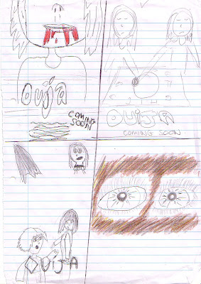
- The top left image is through synergy with a shot we have filmed of Sophie dribbling 'blood' from her mouth. We have followed the conventions of 'coming soon' on this poster.
- The image in the top right hand left corner shows synergy with our initial magazine cover idea of the high angle shot of the Ouija board, with the two hands placed on it, representing they are about to play. We have simply zoomed out of our original idea, and focused on our two characters too. If this were a real film poster, the use of representing well-known actors may lure in a wider audience; therefore here too. We have enlarged the Ouija board however to show this is the main focus, so in a photo the camera would have to almost be at the boards level; highlighting its dominance.
- The bottom left corner illustration shows the two girls running away, but looking back scared. This is synergy with a shot we have filmed of the two girls running through a tunnel, and looking back to pull/help each other. We have also featured separate images to cover to the top half of the poster. Whilst the actress' would dominate, these images would hint at other references in the film. We got the idea for this poster from a 'Harry Potter' film poster, as shown here:
- The bottom right poster from our ideas is of a close up of the protagonist's eyes with mud around them, showing fear, harm and violence. Whilst researching my ancillary ideas, I got influence from the remake of 'Cape Fear's' poster, which features a extreme close-up of De Niro's menacing eyes. Therefore, in our group we decided on following the use of this close-up in shooting, and the use of mud around the eyes was influence from 'The Descent' (as said in a previous blog). Therefore, synergy with the shot can also be found again with this poster:
More of our ideas are featured here:


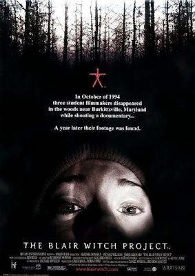
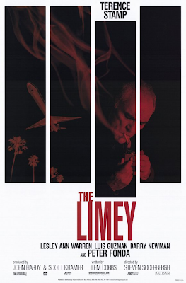
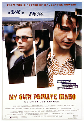
- The next poster features information throughout the page, but the use of split screens to highlight different parts of the film. The two outer splits show an image of a Ouija board, but only segments of it so that it can be understand on the cover. The centre images feature the two main characters - as played by Sophie and Jess - with close-up reaction shots of the two girls. We feel this connotes the girls being divided by the power and curse of the Ouija board, as well as split up and apart from one another. We got influence from the use of these separated shots from posters for both 'My Own Private Idaho' and 'The Limey':


No comments:
Post a Comment