Therefore, I am going to inform of ideas we re-developed; those we scrapped, and those we created. Some of our new shots were from influence from watching various other trailers/films that we acknowledged.
RE-FILM:
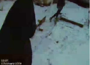
- We featured a point of view shot of Sophie running, facing the camera to her feet. However, this seemed quite blurry and too zoomed in, which we didn't realise until the editing process. Therefore, we will re-film this shot with more preparation, in the same place as before (a path in Whetstone) as shown below from an original shot:
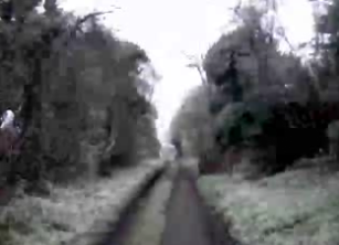
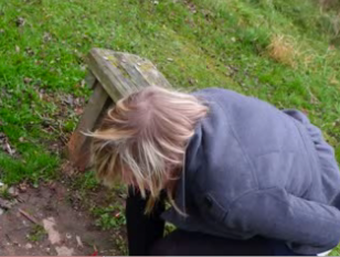
- We filmed a long shot of Sophie on a hill. Our idea was to have her run up the hill and leap in the air as she reached the top, so that when we reversed this during editing it would appear that an unknown force had grabbed her and pulled her down the hill without her permission. However, it wasn't very accurate or realistic once we had presented this, so therefore we have scrapped this; although we liked the idea of a hill, as it resembles climbing up and down (the protagonist's journey in the film). Therefore, we are going to film a high angle shot looking down on Sophie, as she aims to clamber up the hill in desperation. This will represent a force looking down on her, as well as showing her inferiority here. We will be using the same field/hill as before, as indicated here:

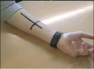
- We are going to re-film more close up shots of Sophie's face, as 'emotion shots'. We filmed one shot in night vision which we already like, although Sophie has glitter on her face. We are going to film various more to use at least one in our trailer. Here is the original reaction shot:

- We are replacing a shot featuring the protagonist's friend appearing to be dead in an illusion as it looked a bit tacky and unrealistic. Instead, we are going to film a shot featuring the friends talking on the phone. We got inspiration for this from 'The Ring', where the girls talk on the phone in the opening scenes.
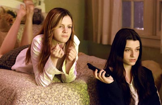
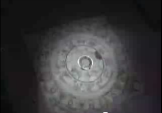
- We are going to include more flash shots of the Ouija board, to emphasis the game and the reasoning behind the film:
- We have changed the title card of 'Here comes a curse...' to another one after a few shots concluding '...that will never end'. Instead, we have altered the words to 'From the acclaimed director of [ ]' ... comes a '[ ]' as this is more popular in trailers. We got influence from 'The Texas Chainsaw Massacre' trailer, which notes 'it was a true story', as well as developing upon this and noting 'from acclaimed director...' We noted that being specific in our titles was more appealing:
NEW SHOTS
As well as this, we have decided to film entirely new shots all together. Some of these shots were influenced from other films/trailers, whilst some were ones we invented ourselves. These new shots that we decided upon include:
- A strangle shot (to make the demon appear to physically harm her)
- A long shot following the two girl friends in the film running and appearing to help one another. This will be filmed in a dark tunnel with the girls reaching out for one another and helping each other escape. The use of the handheld/shaky camera will give a eerie effect, as it will connote that the demon 'thing' is following them
- We are going to scrap our original ending of Sophie appearing to be taken over by the 'thing' and have a possessed voice. From this, we are instead going to combine a shot from Jess' webcam with one of our own camera. This will show Sophie's character updating on her webcam of what is going on around her, although the laptop will fall over alongside a bang/noise, which will then turn to black, pause, and then turn to static. We think this will be easier to correlate and produce. Here is a print screen from our original ending:

INFLUENCE
As well as this, we developed upon ideas that have already been used, highlighting intertextuality. We aimed to focus on those films under the horror/thriller/psychological thriller genre, as we feel these are more appropriate for our filming. Although in a previous blog we posted a diary update of what films have influenced us, the following illustrate the one's we prefer and could complete successfully:
- A bath shot, which will feature Sophie distressed in a bath tub. We got influence from this from Daren Aronofsky's film 'Requiem For a Dream', with the female character screaming under the bath water towards the end of the trailer:
- We noted that our trailer seemed to focused upon human characters; in particular the protagonist. Whilst she is the most vital part of the film, upon researching trailers we noted that a wider range of shots are more appealing to sell the film. Therefore, after watching the trailer for 'The Ring' again, we noted a wide use of focusing on landscapes/settings, so therefore took influence from this. We plan to shoot a range of landscape shots. These form of visuals can be seen here:
- We plan to film a shot of the lead girl struggling in pain. We had already planned to show her throwing up blood again, although after watching the trailer for 'The Human Centipede', we thought the girl dribbling other liquids or spit would look effective. We feel that Sophie spitting her own saliva out in a shot would not look amazingly effective on film, so instead we plan to use milk. Here is the trailer for this influence. The girl struggling on the floor and spitting everywhere is towards the end:
- We may use an echo/distant scream in the editing of the music in our trailer. This can be heard from 'The Descent':
- We noted in the trailer for 'The Dunwich Horror' that the use of research/newspaper/the media news/press is ideal, as it alerts the story within the plot, as well as hopefully to the audience watching it. The use of the media being interested in the story is seen in this trailer. However, we like the use of the magazine/newspaper titles and images correlating and dissolving over one another. Therefore, we are going to film the protagonist researching on her eerie events. We will get books based on ghosts/aliens/the paranormal out of the library, and use dissolve effects of the girl flicking through pages on this subject. Here is our influence:
- We have already edited heavy breathing in our trailer alongside the non-diegetic soundtrack. The use of heavy breathing adds tension, as well as a creep effect. We notified the use of this from the trailer for 'The Amityville Horror':
- We have already focused on the concept of filming the girls emotion repeatedly, although we wanted a widespread view of this. Therefore, upon watching the trailer for ' ' we like the use of a extreme close-up of the eyes, with either mud or blood around them. The use of mud varies as we have already featured blood on the face:
- We also like the idea of focusing on a particular vulnerable area. After watching the trailer for 'Let The Right One In', the use of bloody, muddy fingers and hands is visually appealing for our genre and could be easily done:
WE HAVE ALSO DECIDED TO KEEP OUR ORIGINAL OUIJA BOARD SCENES. WE WERE CONSIDERING MAKING PAPER ONES SO WE COULD FOCUS MORE ON THE LETTERING/MEANING OF THE GAME, ALTHOUGH AFTER EDITING WE FEEL THE 'FLASH' SHOT OF OUR ORIGINAL FOOTAGE OF THE BOARD GAME IS IDEAL AND TO OUR PREFERENCE
No comments:
Post a Comment