MAGAZINE COVER:

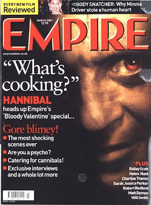
• The magazine headline is positioned at the top centre, likewise to traditional magazine covers. It is bold and striking, alerting the audience to its title
• Unlike the one studied, the price/date is positioned almost within the titles font – therefore combing the advertisement of the magazine itself, on top of the appeal to the audience through its selling point
• The use of the ‘selling line’ is linked to the main image featured for the magazine’s focused article for the particular issue. The use of ‘What’s cooking?’ and the films protagonist ‘Hannibal’ interlinks with the portrayal of the character for the main image. The audience has to use interpretation to understand this selling point, but the deadly sinister eyes of Anthony Hopkins combined with the quote next to his face indicates that this character is making this statement; therefore, adding to questioning, horrific thoughts.
• The top half of the magazine draws more attention, with the striking eyes and magazine title
• Further information about this film is underneath: this is obvious with the use of intertextual red and white colours, linking the pieces of text together. Also, the colour scheme works well with the bold red ‘EMPIRE’ logo
• The barcode is stereotypically situated out of site; at the bottom of the cover in order to divert its lack of information in comparison to what is being featured within the magazine
• The dark colours on the cover indicate a horror, questioning feel, whilst the murky photograph of the individual featured has almost a brown/dirty tinge, combined with a striking red eye; noted for blood, evil, the devil, etc... This releases further information upon this character (i.e. one of horror)
• However, the title of the film is not actually shown on the cover. This adds to a questioning, commercial device; in order for the audience to find out, they must buy the magazine
• The one bold image highlights the feature, although there is one, far more smaller image in the centre top of the cover; actress Minnie Driver, as indicated through the information on the right side. This is in order to add to further feature elements
• Extra cover lines: the cover is not too cluttered, only with information/hints of the main feature e.g. ‘The most shocking scenes ever’; this lures in the audience further. Some further information about what will be included in this issue is then presented in the bottom right hand corner, with film celebrity names to lure in ‘film lovers’ through presenting these well known names. There is probably a hierarchy of ‘well-known’ individuals, with the most known at the top to advertise further information
• The advertisement ‘EVERY NEW FILM REVIEWED’ is the brightest element of the cover. Whilst the majority of the cover features whites, darks and red, this piece is in a contrasting bright yellow. The use of this device with bold, black letters almost screams at the audience. This is in order for a more widespread demographic to purchase the magazine.
POSTER
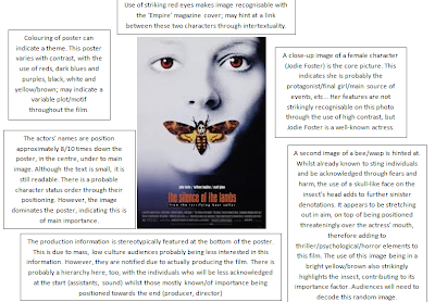
An intertextual link is instantly recognised between the magazine and the poster; both feature a close-up image of an individual (presumably an character in the film to unknown viewers) However, one is male and one is female. Here is my analysis for the theatrical poster for the film, 'Silence of the Lambs':

No comments:
Post a Comment