Tuesday, 15 February 2011
Thursday, 10 February 2011
In todays lesson...
... we concluded our poster!
and we also edited our trailer some more. The order is how we want it now, the title cards are right and we have begun adding the music back on again. Once done this, we are going to edit the colours on our shots so that they all have a similar dark, eerie effect. When finished this, we hope that our trailer will be complete!
On tuesday we will be taking our magazine photographs. Last lesson we began planning the layout of our magazine, but we have had to arrange some images to be put on the cover as well as the main image. From this, we will complete audience research likewise to how we did with our magazine, and then act upon the results.
Possible taglines
In today's lesson, we have discussed some possible tag lines we could include on our poster that would relate to our film. We thought:
- The Game Has Begun
- One Game. No Rules
- When Game Becomes Reality
- There's No Escape from The Board
- No Game. No Pain. (with the 'No's' crossed out)
Upon discussion, we decided upon our first choice, 'The Game Has Begun', and have now included this on our poster to inform the audience further of our plot.
Audience feedback and changes to make on poster
Before concluding our poster, we wanted to analyse our audience feedback and take their comments into account. Therefore, here I will highlight what our demographic audience noted from our questions:
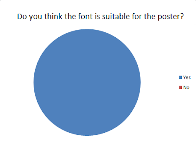
3.
6.
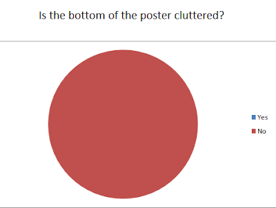
7.
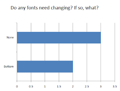
- 'LOOKING AT OUR POSTER, WHAT DO YOU THINK THE FILM IS ABOUT?'
- Politics
- A Ouija Board
- Paranormal
- Psychological
- Horror-based
Therefore, the majority of these results are linked to our intentions. All focus on genres/plot, but 'politics' confused us. However, we asked our researchee why she had answered this, and she got confused over the image of the Ouija Board. However, she read the title aloud, and realised what it then was.
2.

3.
6.

7.

Wednesday, 9 February 2011
Tuesday, 8 February 2011
Our plans...
We have been told that our deadline is for the end of next week or within half term. Therefore, today we have decided that:
- We will finish editing and upload our audience research video for our poster tomorrow
- Afterwards we will focus on their comments and make any adjustments to the poster if needed. We then hope our poster will be finished.
- We then hope to conclude our trailer by the end of the week. We have nearly finished this, although we need to upload sounds again, and possibly experiment with one new sound as this may be a finishing touch. We need to edit the colouring of the images, too, as they all vary and do not correlate successfully together. However, we feel the order/title cards/speech on our trailer are currently finished
- Next week we will focus on and complete our magazine. This will include taking the pictures from our initial ideas, uploading them onto a 'magazine cover'. We will hopefully conduct some audience research alongside this. We will take any of their feedback and make any changes if needed.
- By the end of next week we hope to have concluded all of our products. With this, we will make an evaluation either next week, in half term or the week after, summarising our work, their influences, any changes, etc... in reference to our products.
UPDATE!
Upon analysing our video, we have decided to not include the webcam/static shots or the arm shot. As said, we had difficulty with filming the webcam shot due to this going wrong during filming. However, upon rearranging our teaser trailer with our new shots, we do not feel that these shots are now needed, as they would look random and would make the end of the trailer drag a little. From this, there is no need to include a 'static shot', as this now has no relevance. We also do not feel the arm shot is needed anymore. On top of this taking up time (we would have to film the 'stop motion' on a specific programme on another Mac, as well as transferring this to our Mac. We also need props for this shot), we feel that the shot would seem random. The other shots mainly focus on the protagonist, her friend, the ghostly demon character and some landscape shots. Whilst some shots focus on close ups of the protagonist - e.g. her eyev- there are little shots that focus on specific areas of her body. Therefore, the use of this bloody arm shot may appear alienation in comparison to those other 'action' shots featured in the trailer. We therefore feel these decisions will make our teaser trailer more beneficial.
(In another blog or our evaluation, we hope to note the shots that we did not use in the conclusion of our teaser trailer and our reasons for why)
Monday, 7 February 2011
Audience research questions for our poster
Today we discussed some possible questions we could ask our demographic audience in reference to our poster. Here are the questions we are going to ask:
- Looking at the poster, what do you think this film is about?
- Do you think the title font is suitable for the poster? Why?
- Do you like the colouring of the images?
- Do you think the poster needs a tag line to inform us more of the film?
- Do you think the poster needs more colour?
- Do you think the bottom of the poster is too cluttered?
- Do any fonts need changing? If so, what?
Our possible poster
Here is our poster for our film, 'Ouija'. We have completed this on the Corel programme on the computers at school. We edited the images on paint and varied the colour there, too. We mainly used typical WordDocument fonts for the text, although we used http://www.1001freefonts.com/ for our film title to make it stand out further:
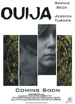
Whilst we are happy with the poster, we feel some audience research would contribute towards our target audience. Therefore, we have started filming people within our demographics - 18-24 - to view the poster, on top of answering questions we feel relevant to our poster. The questions/audience research video will appear in another blog.
Decision
We have been focusing on our poster this week. Upon some discussion, we focused on the poster that gives a 'split image' effect, as we thought it was more unusual and unique compared to our other main poster idea. We also feel it has more connotations and subliminal meanings in reference to our poster. Therefore, we are currently making this poster - having already taken the photographs for it - at the moment.
Tuesday, 1 February 2011
Subscribe to:
Comments (Atom)


