we are using Keynote on the Apple Mac to complete a slide for our evaluation. We have nearly completed our first question on our evaluation, which has consisted of text, images and we are filming videos for it at the moment. We hope to complete our other questions throughout the next week, and finish our evaluation by the week after.
Emma Swinfield A2 Media
Friday, 1 April 2011
Tuesday, 29 March 2011
Products completed
We have now completed all our media products alongside audience research for each one of them. Therefore, we feel our pieces are as successful as they can be at this point, so we feel we can not make any further alterations.
From now we will focus on our evaluation. Yesterday we planned our evaluation on four pieces of A3 paper, with diagrams to show how we will represent our work e.g. an area of work alongside a video, with who can say what. From here, throughout this week we will all individually analyse our blogs and focus on the different questions, answering them in various ways. Therefore, this highlights our varied contributions to our work.
From this, next week if we have completed this planning process, we will begin to make videos and powerpoints on the Apple Mac 'keynote' programme, which will be easy to present and our establish our work.
Final magazine cover
Results from magazine audience research
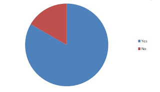
After composing our research, we got the following results from our audience research:
 Whilst one person did answer no, we feel the majority of our demographics felt that the image on our cover represented a horror film, so therefore we will keep the cover image the same
- DO YOU THINK THE COLOURS ON THE COVER COMPLEMENT EACH OTHER?
Everybody answered yes, so we are pleased with the colours
- DO YOU THINK THE COLOURS USED ARE QUITE EERIE?
Everybody answered yes again, so we are again happy with the colour choice
- DO YOU THINK THE COVER PHOTO IS RELEVANT TO A HORROR FILM?
 Whilst one person did answer no, we feel the majority of our demographics felt that the image on our cover represented a horror film, so therefore we will keep the cover image the same
 - DO YOU THINK THE COVER IS TOO CLUTTERED?
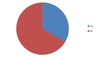
 Again, only one person answered yes, so we feel that the cover cannot be too cluttered and we will therefore keep this the same
- DO YOU THINK THE SELLING LINE NEEDS MORE INFORMATION TO ADVERTISE THE FILM?
 Whilst two people do think that the selling line needs more information, we feel that if we were to add any more text the cover will be too cluttered. Therefore, we will keep the selling line as it is
 - DO YOU FEEL THE ADVERTISEMENT ELEMENTS ON THE COVER ARE ESSIENTIAL?
Everybody answered yes, so no change is needed
- DO YOU FEEL OUR MAGAZINE HAS ENOUGH INFORMATION?
Everyone answered yes, so no change is needed
- LOOKING AT THIS MAGAZINE, DOES THE COVER FEATURE MAKE YOU WANT TO WATCH THE FILM?
Everyone answered yes, so no change is needed
Monday, 28 March 2011
Wednesday, 23 March 2011
First magazine cover draft
Tuesday, 22 March 2011
Subscribe to:
Comments (Atom)

